How it works
User’s walk into a dispensary, approach a tablet, complete the survey, and get recommended products based off the answers.

UI Casestudy
November 2022 - January 2023
Supporting solutions dedicated to the education for Users in the world of Health and Wellness.
Weston Jacey
User’s walk into a dispensary, approach a tablet, complete the survey, and get recommended products based off the answers.

The product’s main issue was that their interface lacked a “wow factor”, resulting in lower conversion rates and a lack of trust in the product.
Our Goal as UX Designers was to combine UX Research methods with modern and unique visual design trends to redesign & rebrand GetGenetica’s Survey and recommended products interface.
Our stakeholder's wanted a makeover of the interface. After performing a Heuristic evaluation and contextual inquiries with five Users, our team saw opportunities to improve the overall User Experience.

The overarching problem for Flora was that Cannabis users using Flora AI felt overwhelmed due to a lack of knowledge when answering questions, thus losing out on the best recommendations.
User Focus:
How might we educate users on terminology and jargon they don’t understand within Flora?
How might we allow users to get a more in depth understanding of the products they are being recommended?
Stakeholder Focus:
How might we redesign the Interface to give it that “Wow factor”, without overwhelming new Users?
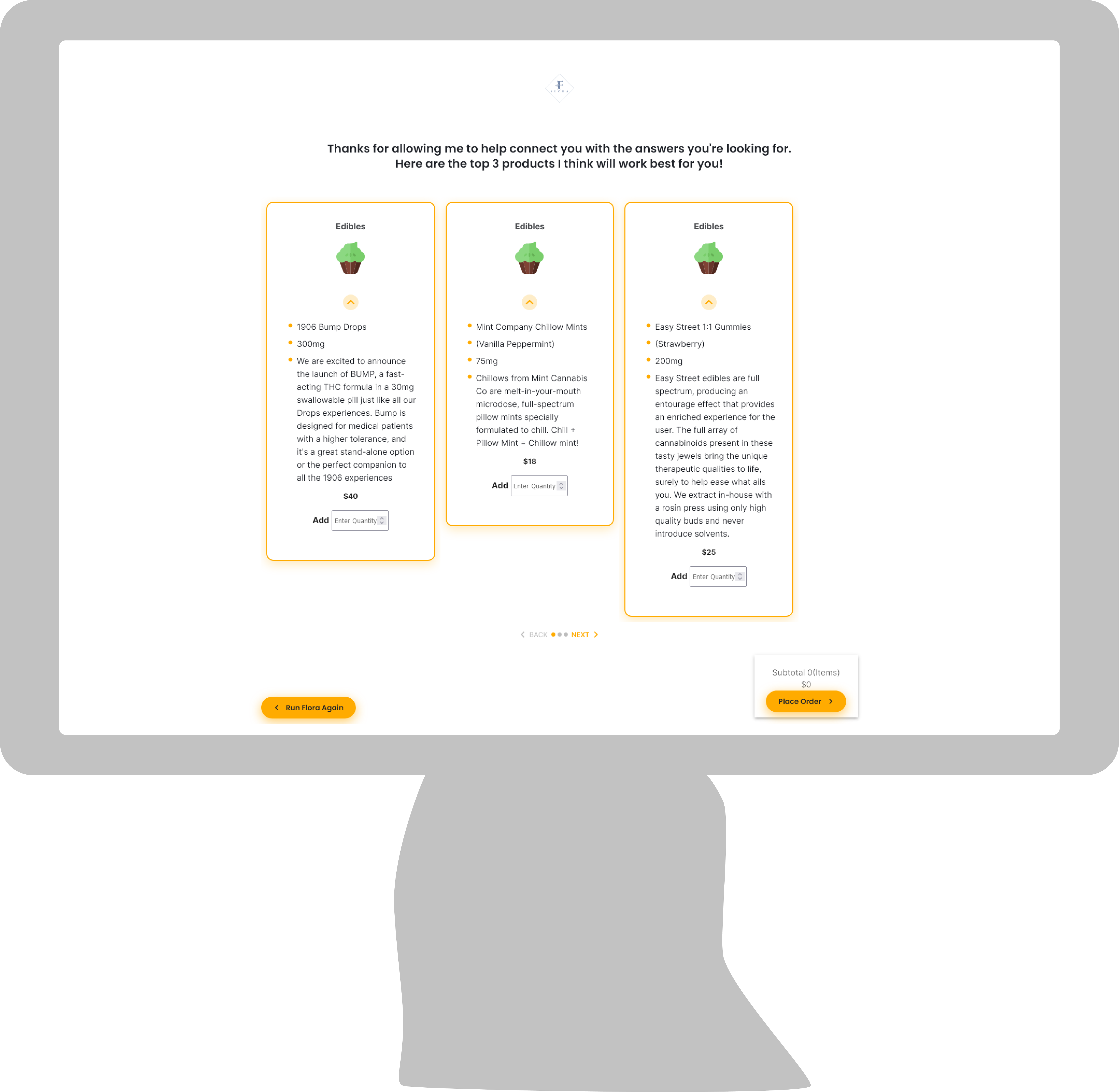
*Pictured is retrospective product recommendation page

Addressing: How might we educate users on terminology and jargon they don’t understand within Flora?
We embedded a small help button into each selection that uses jargon or unclear terminology. From our research, this feature proved to be very helpful for new Users.
Addressing: How might we redesign the Recommendation Interface to give it that “Wow factor”, without overwhelming new Users?
We wanted to give the User a view of products that went past vector images. From our research, we found that Users wanted multiple products per category selected in the survey, so we gave them a modern E-Commerce experience for easy viewing and purchasing.
Addressing: How might we allow users to get a more in depth understanding of the products they are being recommended?
In the original system, there was no place to view a product for more information. We wanted to give an in-depth view of the product they are getting recommended. We also incorporated color coded percent matches to
After performing a heuristic evaluation and contextual inquiries on the retrospective interface, defining pain points, challenges, and the journey a User goes through, we were able to create flows for each screen.


From our contextual inquiries with our users, we found that the current design system had room for improvement. Part of our goal was to establish trust with new customers, and the current color scheme and branding wasn't conveying that message to our Users.

We decided to go with a blue color scheme to establish confidence within our Users using the system. Blue is a color that is known for trust and dependency, and this is what we wanted Genetica's brand to reflect.
One piece of feedback we got from our User's on the old system was that the buttons were difficult to press because they were narrow rectangles. We wanted to go with a button that had a large surface area, while keeping they layout spaced out. We chose to use hexagons as buttons because they mimicked cannabinoid structures which tied back to the brands extensive library of cannabis research.

